Christopher Morris is a Brooklyn-based designer with a strong focus on interface design, brand identity, and web development. He graduated from Columbia College Chicago, receiving a B.A. in Graphic Design with a concentration in Web Design and a minor in User Experience Design. He’s motivated by solving complex problems with simple, meaningful solutions.

| currently exploring new opportunities.

2D Classics

Scope

Iconography

*

Animation

Year

2019

Timeline

1 Month

The challenge was to create a set of icons inspired by some of the most beloved 8-bit video games—Super Mario, Pokémon, Pac-Man, and Galaga.

2DC Switch Mockup
2DC Super Mario Icon 2DC Super Mario Icon

Grid system

As a way of capturing the essence of these video games and paying homage to their graphics, each icon follows a pixelated style composed from an underlying grid system. That way, the icons are simply children of the same parent, all unique in their own way, but quickly recognizable as a family.

2DC Pokémon Icon 2DC Pokémon Icon
2DC Stamp Mockup 2DC Icon Set

Adding color

Once the icons were complete, the focus shifted to incorporating more elements reminiscent of the original games. By selecting colors respective to their titles, the icons came to life, enhancing their visual appeal and evoking a sense of nostalgia.

2DC Pac-Man Icon 2DC Pac-Man Icon
2DC Switch Mockup

Light and dark

Understanding the importance of versatility and compatibility, the creation of light and dark versions for the Nintendo Switch game console ensured a seamless integration, providing a cohesive and immersive experience.

2DC Galaga Icon 2DC Galaga Icon
2DC Animation 2DC Phonecase

Amphibian Foundation

Scope

Logo

*

Brand Identity

*

Animation

Year

2019

Timeline

2 Months

The Amphibian Foundation connects individuals, communities, and organizations in order to create and implement long-term solutions to address the global amphibian extinction crisis.

Amphibian Foundation Frog Amphibian Foundation Logo

Developing a strategy

To generate interest from potential partners and encourage them to become involved in the cause, the foundation recognized the need for a distinctive and engaging brand identity. It was crucial to find a balance between a playful and fun image while maintaining a sense of quality and integrity.

Amphibian Foundation Business Animation Amphibian Foundation Bus Sign Amphibian Foundation Business Card

Wordmark

After careful consideration, I made the decision to include the foundation's name in the logo design. The use of vibrant green and pink colors symbolizes the beauty and vitality of the waterlily, a plant commonly found in the natural habitats of amphibians.

Amphibian Foundation Mockups Amphibian Foundation Frog

California Science Center

Scope

Logo

*

Brand Identity

*

Animation

Year

2020

Timeline

4 Months

Link

Brand Manual

Located in Exposition Park, Los Angeles, the California Science Center is a hub for science education and exploration, offering a wide range of exhibits and instructive programs.

California Science Center Stationery
California Science Center Poster California Science Center Pin Button

The challenge

With the opening of the museum's new Samuel Oschin Air & Space Center as well as the success of the Science Center School, the CSC required a new brand identity. One that encapsulated the energetic atmosphere of its facilities while also reflecting the sense of wonder and curiosity ever-present in the museum's fun, interactive environments.

California Science Center Logo
California Science Center Bag California Science Center Logo Photo
California Science Center Animation

Creating the logo

Drawing inspiration from the iconic NASA space shuttle mission insignias, the resulting logomark is emblematic of the California Science Center's optimistic outlook and everlasting desire to explore the unknown.

The dynamic design portrays movement and adventure, mirroring the enthusiasm of the children who visit the school and the captivating experiences that await guests at the museum.

California Science Center T-Shirt California Science Center Logo Facemask
California Science Center Stationery

CreatorDAO

Scope

UI/UX

*

Design System

Year

2023

Timeline

3 Months

I led the design team at CreatorDAO, a company leveraging blockchain technology to revolutionize the creator economy. The endeavor consisted of making a design system from scratch, building an internal dashboard for their community, and collaborating with engineering to implement the final screens.

CreatorDAO Proposal Page
CreatorDAO Posters CreatorDAO Animation

Visual inconsistencies

Prior to my joining, the very talented designers at Red Antler established the company's brand identity. However, with a bold, expressive look and feel, the CreatorDAO team often struggled to imbue those characteristics into their product design. The result was a lack of cohesion throughout their website and products.

New color palette & design system

My approach to the problem was twofold. First, I expanded the color palette, adding several neutral colors for UI elements and surfaces. The neutrals contained subtle hints of the brand's core colors to help bridge the gap between brand and product.

Then, I translated the brand guidelines into a comprehensive design system. It documented all of our colors, type treatments, graphic elements, and components and allowed us to reuse the same assets across all screens.

This methodology ensured visual consistency, a key ingredient in product usability and brand recognition.

CreatorDAO Icons CreatorDAO Mobile Mockup
CreatorDAO Proposal Submission
CreatorDAO Module Set CreatorDAO Module

Decentralized governance

One of the highlights of the project was the proposal system. A tool with which CreatorDAO members could put forward various initiatives for the broader community to vote on, such as allocating budgets or grants to particular groups, forming partnerships and collaborations, and exploring long-term investment opportunities.

The feature assures that decision-making within the organization is participatory, transparent, and decentralized, encouraging members to have a say in the direction and management of CreatorDAO. It fosters collective engagement and empowers stakeholders to contribute to each other's success.

CreatorDAO Interface

Formal Systems

Scope

UI/UX

*

Development

*

Design System

Year

2021

Timeline

4 Months

Link

Visit Site

Using the p5 javascript library, I designed and developed a site showcasing a collection of six immersive artworks. Each piece utilizes its own unique behavior and functionality, inviting users to discover the endless possibilities of interactive art.

Formal Systems Mockup
Formal Systems Vertices Page

Prototyping

After deciding on a rough layout, I began testing different interactions and canvas behaviors with users. Whether the input was a click, click and hold, or click and drag, all actions were refined to feel intuitive, satisfying, and clearly connected to what was happening on screen.

I quickly learned that the creative output could change drastically depending on the input—which ultimately became a great asset and defining feature.

Formal Systems Icons Formal Systems Mockup

Responsiveness

The user experience needed to remain consistent no matter the screen size or device type. Through a series of iteration and optimization rounds, I made sure that end-users could interact with every artwork on mobile using touch gestures in the same way they could on a desktop with a mouse.

Challenges and constraints

p5 canvases can become quite resource-intensive, leading to drops in frame rate and stuttering. There were trade-offs between an artwork’s concept (or stylistic direction) and performance issues. With this limitation in mind, I continued to strive for the best artwork execution, but always prioritized performance.

Formal Systems Picutresque Page
Formal Systems Mockup

Final details

As the project neared completion, I still looked for ways to improve the user experience. While ideating, I was reminded of the Etch A Sketch, a toy used for drawing from my childhood.

I realized it shared similar qualities with the canvases in Formal Systems. I wrote a list of the affordances of each product and compared the two. It was evident that Formal Systems could benefit from an erase function like the one in the Etch A Sketch.

I then introduced two welcomed features to the project: the “clear” and “save” buttons. The clear button adapts to each artwork, but it essentially changes or erases what’s on the canvas. The save button improves upon the user experience from the Etch A Sketch. It promptly screenshots and downloads the artwork, allowing the user to save or share their creations. By doing so, the experience lasts long after the initial interaction.

Formal Systems Six-Fold Page

Light-Dark Mode

Scope

User Research

*

Data Visualization

Year

2020

Timeline

2 Months

Link

Full Study

I conducted research on color schemes in user interface design, focusing on the prevalence and potential benefits of light mode versus dark mode for smartphones. The primary goal was to determine which mode is more common and which provides a better user experience.

Light-Dark Mode Data Module Light-Dark Mode Data Module

Research methods

I reviewed academic literature about the impact of using different color schemes in UI design. In the process, I identified legibility, personalization and customization, emotion and perception, health effects, and performance as significant factors in shaping the user experience for both light and dark modes.

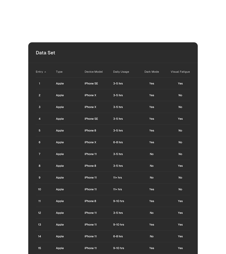
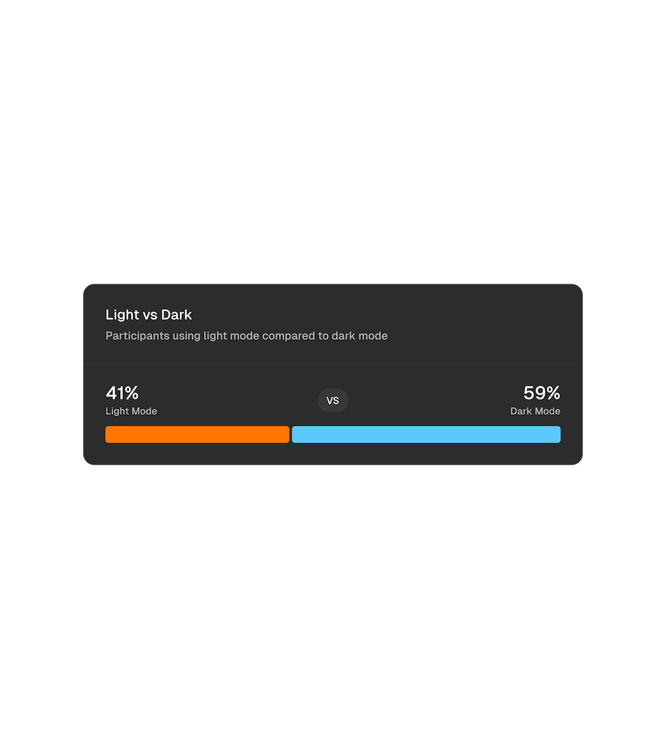
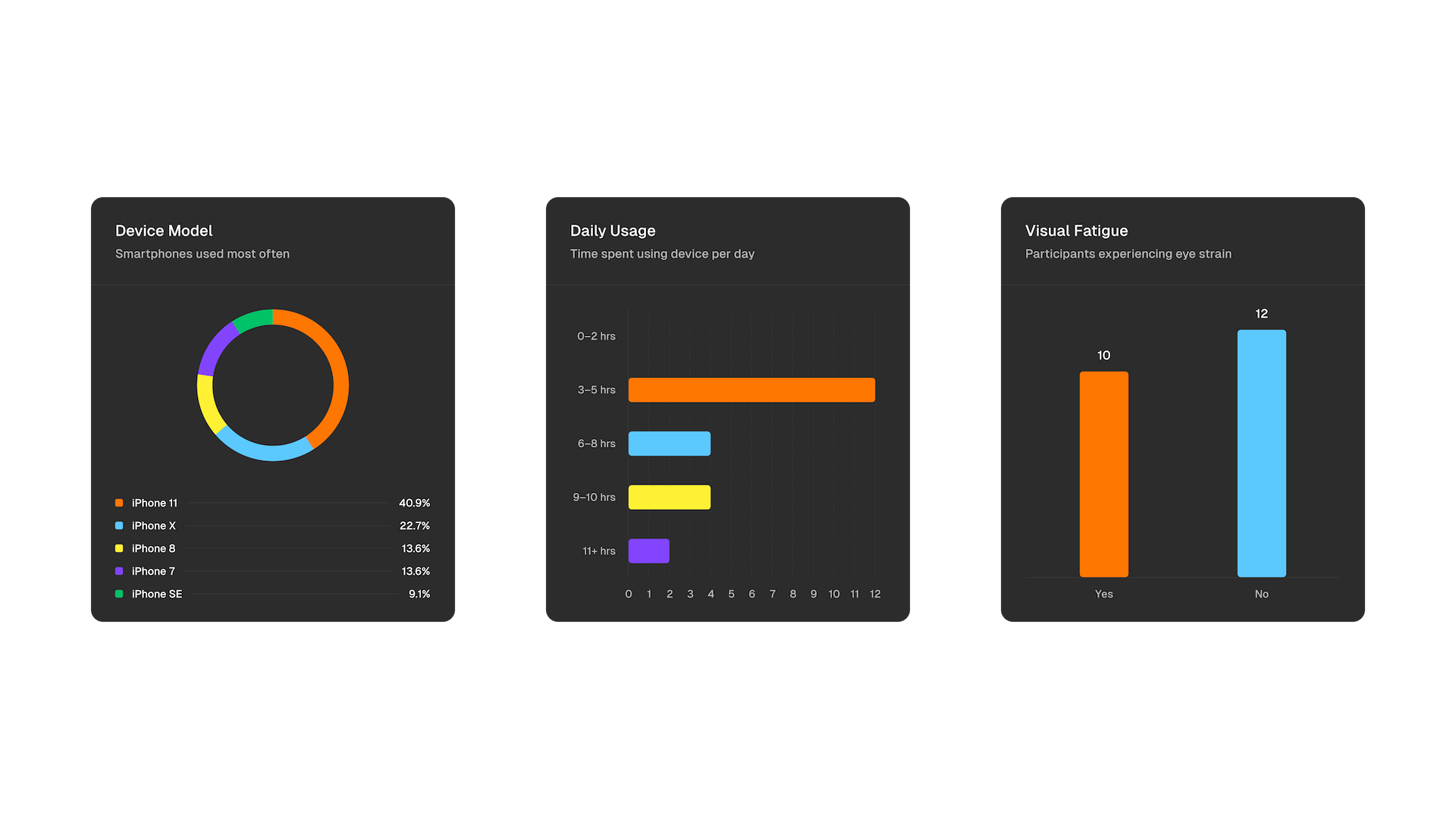
Additionally, I set up an online survey to collect data on participants' smartphone make + model, preferred color mode, usage habits, and any eye strain experienced due to prolonged screen time (hoping to gain insight into whether one mode was more likely to cause visual fatigue than the other). I distributed it via email and across social media platforms over several weeks.

I then utilized Python to process and structure the data I received from the survey. I leveraged libraries such as Pandas for data indexing and Matplotlib to visualize trends, themes, etc.

Challenges and constraints

In total, 22 participants completed the survey, resulting in a relatively small sample size that inevitably influenced the variety of responses I could obtain. For example, all participants reported using an Apple smartphone as their primary device, which introduced a significant bias and made deriving conclusive insights challenging. This sameness limited the applicability of my findings to the broader population and emphasized the need for caution when interpreting the results.

Nonetheless, the data collected potentially serves as a foundation for more extensive, representative research.

Light-Dark Mode Data Module

Findings

After synthesizing the existing literature, it became clear that despite light mode's advantages in legibility and positive sentiment, dark mode presents more substantial benefits in physical health, mental health, and device performance.

Using the data collected from the survey, I employed a T-test to compare eye strain between light and dark mode users. It revealed no significant difference (p = 0.94), indicating that having one mode versus another may not substantially affect eye strain as previously hypothesized. Interestingly, the dataset also pointed out that a majority of participants preferred dark mode.

That is to say, dark mode seems to provide a better user experience overall and was more common among participants.

Retro

Future studies should aim to include a broader, more diverse participant pool to ensure findings are reflective of the general population. Also, an inquiry into participants’ visual condition (normal, corrected to normal, color blindness, etc.) could give a better understanding of user preferences and the reasonings behind them.

StemsDAO

Scope

Logo

*

Animation

Year

2022

Timeline

2 Weeks

A group of musicians and music enthusiasts building a new approach to music entertainment and interaction. The platform facilitates collaboration among artists by allowing them to list stems, samples, and one-shots as NFT “music legos.”

StemsDAO Animation StemsDAO 3D Render

Designing for a Web3 community

For display on their website and merchandise, StemsDAO was looking for a way to visually represent their unique role in Web3 and bring more energy to their brand. Based on their previous logo, I designed a wordmark heavily influenced by blockchain technology, building blocks, and album covers. Each letter of the name occupies a perfect 1-by-1 ratio.

StemsDAO Animation

UNVEIL

Scope

UI/UX

*

Development

Year

2024

Timeline

1 Week

Link

Visit Site

I developed a bespoke website for UNVEIL, a technology-driven creative studio offering sophisticated art direction/execution for brands. The directive from the team was to design an online space with a "visually striking and memorable user experience" for them to present their work and distinct approach.